Friday, January 31, 2014

Creative Book Cover Design - Chip Kidd

I recently perused the book, Chip Kidd Work 1986 - 2006, Book One, because I was inspired by a video of Chip Kidd talking about his book cover designs. Many of his designs are brilliant and clever, including this one that he designed for a Clint Eastwood biography. I've always been an Eastwood fan; he is the epitome of the gritty, tough, weathered but classically handsome "cowboy" character in westerns who always says cool things at the right times. He's much more than that, but he's best known for these roles and also for his roles as cops as in Dirty Harry. In any case, shooting and guns were a big part of the majority of his films.

The book cover features a closely-cropped photo of the strikingly attractive Eastwood doing his classic "Clint squint." The photo has been made to look like it has bullet holes, and Kidd cleverly placed words within these holes. The name, EASTWOOD, printed in all caps at the bottom, is what you first see in terms of type, and EASTWOOD combined with that face is all that's needed to get anyone's attention. At a closer look, you see the bullet holes, and therein lies the brilliance. The color scheme and contrast between the stark white letters and black background on the bottom strip and the dark eyes and eyebrows against his golden-ruddy skin tones works very well. It's basically a symmetrical design but also well balanced top to bottom, and the bullet holes make it much more interesting than just a symmetrically designed book cover. Love it. 


"Go ahead, make my day."


Citation: Kidd, Chip.Updike, John.Book One: Work, 1986-2006. New York : Rizzoli, 2005. Print.

Tuesday, January 28, 2014

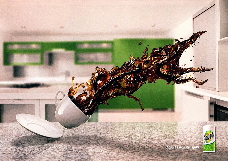
Amazing Paper Towel Ads!


I found this series of Bounty consumer advertisements in the Communication Arts Advertising Annual (54) from November-December, 2013. I think they are remarkable! The message is definitely that a little thing like the right paper towel can take on "monster" spills. The graphic work is outstanding. I love how the liquid spilling out of the glass or cup is taking on the shape of something out of the insect fear film genre from the 60s (I think it was the 60s). The mid-air "pre-spills" appear very scary, powerful, and out to do evil damage! Also, it's totally humorous, which I love in advertisements. Being a spiller, myself, I got a special kick out of these, and I'm also inspired by them in terms of what is possible in Photoshop and all the other amazing graphic design computer programs I'm learning how to use. They're just brilliant!


Credits:
Julian Newman, art director
Dennis Greeley, writer
Dennis Greeley/Julian Newman, creative directors
David Corr, executive creative director
Rob Feakins, chief creative officer
Saddington Baynes, retoucher
Publicis Kaplan Thaler, ad agency
Procter & Gamble, Bounty, client

Saturday, January 18, 2014

Panda Fashion

This image is an advertisement that I found in Lürzer's Int'l Archive: Ads, TV and Posters worldwide, Vol. 3-2001. It is advertising small glasses from the Marui fashion store (a once well-known international web shop that was based in Tokyo; it no longer exists as of 2008).


I am always drawn to photographs of animals, and this ad is particularly eye-catching as it shows a panda (or three different pandas) "wearing" different shapes of sunglasses, with only the words "IMAGE CHANGE" at the bottom. At first glance, it struck me as very cute and interesting, but I didn't know why the black around the eyes had different shapes; this made me curious to find out, which is what a well-designed advertisement should do. All I had to do was read the fine print "Small glasses from the Marui fashion store," and it was instantly clear. I found it to be very clever as an advertising design.

The designer's idea was very witty and playful. Also, the contrast (pandas being black and white) is extremely bold and grabs one's attention easily. The balance of the design is basically symmetrical, but it isn't at all boring because of these three funny, cute, interesting faces with what appear to be little smiles on them. This is a design that does not require many words. IMAGE CHANGE is all that is needed along with the photos to attract attention enough for people to lean in closer to see what it's all about. I think it's a fantastic design. Photoshop was likely used, and it's the perfect application for that particular software. Brilliant.

Tuesday, January 14, 2014

"Preblog" Blog - Testing...1..2..3..

So another semester begins! This is just a test blog to see how I want to format it. I'm going to insert an image to see what that will look like as well.


I was thrilled that Mobile Mutts Rescue Transport Organization decided to use the logo I designed in my typography class last semester! It's seen here on the first volunteer of the year award. It's also on their website and will appear in a book about dogs and rescues that will soon be available for purchase. Woohoo!