Tuesday, March 4, 2014

GRAPHICALLY CLEVER DESIGN FOUND IN GRAPHIS

The Sydney Dance Company "The Director's Cut" sign, by Vince Frost of Frost Design, is an design that I find extremely conceptually interesting. It caught my eye as I was looking through a Graphis Annual (Poster Annual 2007). The play on the words "DIRECTOR'S CUT" with the dancer swinging from or trying to hold on to the large C and appearing to have been cut and bleeding is brilliant (has he been cut by the letter C?). The dancer's body makes a strong and powerful shape, and the blood gives the message that what you will see from the Sydney Dance Company is cutting edge work.


Also, the typography is very clever at the bottom, the way SYDNEY and DANCE share the letters D, N, and E. It's almost like the words/letter are dancing. The font is Futura—a great choice. Very readable.

Interestingly, a case was filed at the Advertising Standards Bureau about this image, saying that the life size billboard contained "offensive and “in your face” gore. (Read the complaint file) The case was dismissed, basically because it was being used for art/dance.

I like that the image is mostly white, red, and black. Also, the photo-typography relationship is done really well. The entire design is well-balanced, and the clever concept attracts interest and curiosity about the company and the concert (or concert series). Very cool.

Monday, February 24, 2014

And The Winner Is..... STUNNING!

I've actually never seen the TV series, The Good Wife, but I understand it's pretty popular and well-done. So, I had no particular ties to the show or the actress (although she is gorgeous) when I came across this image in the Communication Arts Typography Annual.

That being said, I absolutely LOVE this award-winning 2013 Emmy Award advertisement! It was an entire campaign, each ad featuring "custom typography swirling around the stars of the network's [CBS] most popular dramas, including Blue Bloods, CI, Elementary, NCIS, and The Good Wife." (CA, p. 124) As it turns out, The Good Wife and its star, Julianna Margulies have won and been nominated for Emmy Awards since 2010 (4 wins and 30 nominations) as well as numerous awards and nominations from other organizations such as People's Choice Awards and AFI Awards. Well, enough about that.


The collaboration between Mattson Creative design firm and CBS has resulted in print ads that are absolutely stunning in their typography, photography, composition, and aesthetic beauty. What I like most is the way the typography seems to have a life of its own and dances around Julianna playfully and gracefully; it looks like an entity that was in the room with her as the photo was being shot. Parts of it go in front of her and parts go behind her. She's a very elegant figure, and the typography is elegant, to say the least. I've always loved decorative typography with lots of curves, swirls, loops, and spirals, and this one is especially beautifully designed. In the composition, white lettering contrasts with a dark gray background; the type and background contrast starkly with the rich red color of her dress. She is the focal point, yet the typography absolutely cannot be ignored. It's designed so well, you almost can't imagine one without the other. Amazing.

Just for fun, I had to look at Mattson Creative's web site, and I found images of two other posters from this campaign in addition to an illustrated image from a short animated spot based on The Good Wife, so I'm also posting those because it's interesting to see part of the rest of the series as well as another design style and medium with the same subject matter. I love how all of the posters use the same typography (but treated differently in these two) and only black, white and shades of gray with red being the only other color. I also love the idea of a short animated piece using the style of illustration in the last image below. Cool stuff!

“Ty is far beyond a designer, he is an artist and his approach to design is always fresh and innovative. I am a huge fan of Ty's work! Not only is he amazingly talented he is a wonderful person, extremely professional and fast!    - Lauri Metrose, Sr. VP Communications, CBS TV Studios

"CBS commissioned Mattson Creative to design a series of animations based on their current hit shows. We created bold and colorful graphic interpretations for ten of their top programs. The individual spots aired nationally in 2012 and the complete 60 second sequence, featuring all of the shows, was used to open the CBS Upfront at Carnegie Hall." - Mattson Creative web site

Sources
The Good Wife print ad from the 2013 Emmy campaign, designed by Erik Marinovich, typographer and Ty Mattson, art director at Mattson Creative design firm (Irvine, CA), designed for CBS.
From Communication Arts Typography Annual 4, January/February 2014, p. 125. 

The two other print ads and the illustrated image are from Mattson Creative's web site, http://www.mattsoncreative.com.

Sunday, February 16, 2014

NEKO CASE-INSPIRED ILLUSTRATION

Looking through the Communication Arts Annual (cited at the end), this illustration caught my eye immediately because of the movement, the animals, the colors, and the sense of fantasy/adventure. At first glance it would appear the red-haired girl is running from the animals, being chased by them; however, the title indicates that she is one of them, running with them, barefoot, wild, at one with nature in a forested area. It looked so familiar to me! Then I had an "aha" moment as I read the description and realized that the girl is Neko Case, an amazing singer/songwriter who seems to feel this way about herself, according to what I've read about her and images I've seen. (And she does have beautiful red hair.) 

I'm An Animal, by Jensine Eckwall
I looked at the Neko Case CDs I have to see if there is any similarity in the illustrative style (I was sure there was). Eh...not so much; but this one, "Fox Confessor Brings the Flood," does have certain similarities, the decapitated Neko Case heads notwithstanding.

Back cover, Fox Confessor Brings the Flood, by Neko Case
Then I remembered a video I'd seen for her song "Maybe Sparrow," and I watched it again. She does have a love for animals and the wildness of the world. The video combines animation (illustrative) and reality. It's worth watching. See it here:

ANYWAY, I'm An Animal is so "alive." the composition is so well-balanced and unified. Everything in the image—the direction of the animals' movement, the trees, the shape of the path, the girl's hair blowing back—creates a circular movement that keep your eyes following it around to the focal point (the girl), who is also made to stand out by the contrast between the snowy white background and the black dress and streak of red hair. The detail is amazing, and the line of animals doesn't end, as you can see teeny images on the far right of more coming. 

WAIT! As I continued looking more closely (how did I possibly miss this before?), I saw that the girl has a knife! Then I realized that she is among, actually leading the line of predators (and how did I not notice this at first either?); all of the animals, beginning with the girl, are predators of one kind or another, and they are all chasing the deer! Wow. Maybe as you looked at the image, you noticed these things right away. It made me feel so unobservant for not seeing them before. I think it's brilliantly done.

Neko Case has a liking for the bizarre and the macabre. Her songs often combine beauty with the sometimes ugly truths in this world. I saw her live at the Canopy Club a few years ago, and the imagery in the show was an important element that vividly complemented the music (she had an imaginative stage set including a giant owl looming above as well videos and projected images behind her and the band). In I'm An Animal, Jensine Eckwall captures beauty combined with the macabre/ugly truth so well. The piece is stunningly beautiful and haunting, but upon closer inspection, it (for me) elicits a feeling of almost horror or dread about what's going to happen to the deer. Or maybe the deer will outrun them all. I don't think that's really the point. The point is that the girl—Neko—is among the predators of the world, and it's not good or bad—it just is the way things are. All animals do what is in their nature to survive. And in this case, she is the leader of them all.

In terms of the composition, it's amazingly well-designed and also beautifully detailed. I love it. I even have a Pinterest board of just illustration. I absolutely love detailed illustration, especially of animals or animals with people. No wonder this one stood out to me as much as it did.

Source
I'm An Animal, by illustrator Jensine Eckwall, "a conceptual portrait of the singer Neko Case, who exerts a major aesthetic influence on me." (Personal work)    Jensine Eckwall's website
From Communication Arts Typography Annual 4, January/February 2014, p. 211. 


*An additional point of interest: After writing this blog, I opened Itunes and started listening to Neko Case songs, and whadayaknow? She has a song titled I'm An Animal on her 2009 CD Middle Cyclone!

I'm An Animal song lyrics (from MetroLyrics)
you could say it's my instinct
yes, I still have one
there's no time to second guess it
yes, there are things that I'm still so afraid of
but my courage is roaring like the sound of the sun
cause it's vain about its mane and will reveal them to no one
and I'm an animal, you're an animal too
pick up that rock, drink from that lake
I do my best but I'm made of mistakes
yes, there are still things I'm still quite sure of
I love you this hour, this hour today
and heaven will smell like the airport
but I may never get there to prove it
so let's not waste our time thinking how that ain't fair
I'm an animal, you're an animal too
you're an animal too


Sunday, February 9, 2014

DEFYING GRAVITY


This is another book cover designed by Chip Kidd. I love the manipulation of the photography. It's so evocative of a magical, dreamlike state of mind. The photo shows the spine of the book as well as the cover, and I really like how the image begins there (it may carry over to the back of the book as well). The color choice (basically a monochromatic scheme using blues) is also a factor in evoking a somewhat eerie, mystical mood. The slight graininess is also effective. The layout and design are fantastic; the design is balanced and is unified by color and proximity. The typography is simple, and the hierarchy is very easy to read. I like the widely-tracked letters in the title and author's name.

Mostly, I like the obvious. The water is defying gravity. It's like it has a life of its own. It began to pour out of the glass, but then changed its mind and decided to go up instead of down. It's a brilliantly intriguing design for true stories that have to do with magic or possibly making things happen with the mind. I would love to be a book cover designer. I find Chip Kidd's work very inspiring!


Citation: Kidd, Chip.Updike, John.Book One: Work, 1986-2006. New York : Rizzoli, 2005. Print.

Friday, January 31, 2014

Creative Book Cover Design - Chip Kidd

I recently perused the book, Chip Kidd Work 1986 - 2006, Book One, because I was inspired by a video of Chip Kidd talking about his book cover designs. Many of his designs are brilliant and clever, including this one that he designed for a Clint Eastwood biography. I've always been an Eastwood fan; he is the epitome of the gritty, tough, weathered but classically handsome "cowboy" character in westerns who always says cool things at the right times. He's much more than that, but he's best known for these roles and also for his roles as cops as in Dirty Harry. In any case, shooting and guns were a big part of the majority of his films.

The book cover features a closely-cropped photo of the strikingly attractive Eastwood doing his classic "Clint squint." The photo has been made to look like it has bullet holes, and Kidd cleverly placed words within these holes. The name, EASTWOOD, printed in all caps at the bottom, is what you first see in terms of type, and EASTWOOD combined with that face is all that's needed to get anyone's attention. At a closer look, you see the bullet holes, and therein lies the brilliance. The color scheme and contrast between the stark white letters and black background on the bottom strip and the dark eyes and eyebrows against his golden-ruddy skin tones works very well. It's basically a symmetrical design but also well balanced top to bottom, and the bullet holes make it much more interesting than just a symmetrically designed book cover. Love it. 


"Go ahead, make my day."


Citation: Kidd, Chip.Updike, John.Book One: Work, 1986-2006. New York : Rizzoli, 2005. Print.

Tuesday, January 28, 2014

Amazing Paper Towel Ads!


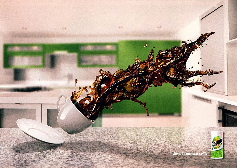
I found this series of Bounty consumer advertisements in the Communication Arts Advertising Annual (54) from November-December, 2013. I think they are remarkable! The message is definitely that a little thing like the right paper towel can take on "monster" spills. The graphic work is outstanding. I love how the liquid spilling out of the glass or cup is taking on the shape of something out of the insect fear film genre from the 60s (I think it was the 60s). The mid-air "pre-spills" appear very scary, powerful, and out to do evil damage! Also, it's totally humorous, which I love in advertisements. Being a spiller, myself, I got a special kick out of these, and I'm also inspired by them in terms of what is possible in Photoshop and all the other amazing graphic design computer programs I'm learning how to use. They're just brilliant!


Credits:
Julian Newman, art director
Dennis Greeley, writer
Dennis Greeley/Julian Newman, creative directors
David Corr, executive creative director
Rob Feakins, chief creative officer
Saddington Baynes, retoucher
Publicis Kaplan Thaler, ad agency
Procter & Gamble, Bounty, client

Saturday, January 18, 2014

Panda Fashion

This image is an advertisement that I found in Lürzer's Int'l Archive: Ads, TV and Posters worldwide, Vol. 3-2001. It is advertising small glasses from the Marui fashion store (a once well-known international web shop that was based in Tokyo; it no longer exists as of 2008).


I am always drawn to photographs of animals, and this ad is particularly eye-catching as it shows a panda (or three different pandas) "wearing" different shapes of sunglasses, with only the words "IMAGE CHANGE" at the bottom. At first glance, it struck me as very cute and interesting, but I didn't know why the black around the eyes had different shapes; this made me curious to find out, which is what a well-designed advertisement should do. All I had to do was read the fine print "Small glasses from the Marui fashion store," and it was instantly clear. I found it to be very clever as an advertising design.

The designer's idea was very witty and playful. Also, the contrast (pandas being black and white) is extremely bold and grabs one's attention easily. The balance of the design is basically symmetrical, but it isn't at all boring because of these three funny, cute, interesting faces with what appear to be little smiles on them. This is a design that does not require many words. IMAGE CHANGE is all that is needed along with the photos to attract attention enough for people to lean in closer to see what it's all about. I think it's a fantastic design. Photoshop was likely used, and it's the perfect application for that particular software. Brilliant.