Sunday, May 11, 2014

Beautiful Exterior = Luscious Contents


Chocovic Coberturas Selváticas by Paul Núnez Associats, Spain, 2007. "The exotic provenance of the cocoas used in these gourmet chocolate bars is expressed through Eva López's Rousseau-esque 'wild forest' illustrations." (Kirkpatrick, p. 60)

Beautifully designed. Alluring. Fantastic. HAS to be delicious chocolate!

I absolutely love these chocolate packaging designs. I came across them while doing research for Project 3 (organic food packaging redesign), and they particularly struck me due to their stunningly illustrated jungle/forest motifs at the top combined with the beautifully simple typographical treatment at the bottom. I want my chocolate to be rich, and I would describe these packaging designs with the same word. 


I have a special personal relationship with chocolate (especially dark chocolate), and I suppose it isn't a particularly healthy one. Be that as it may, really, really good chocolate takes me away to a special paradise for the few magical minutes of tasting, feeling, consuming, experiencing it. I sometimes close my eyes to focus purely on the senses of smell, taste, touch, and swallowing. The creamy texture, the sweet/bitter-sweet flavor, the sensations throughout the mouth...it's exquisite. My my my.

Okay. I'm being overdramatic. 

My point is that the brilliant thing about each of these designs is the paradise-like colorful and detailed illustration that is highly reminiscent of the work of Rousseau placed atop a very simple and appealing bright rectangle with excellent, clean, and clear typography, including typeface choices, alignment, and hierarchy. (I recognized the similarities to Rousseau's work before reading the description at the top; Rousseau is my absolute favorite artist from my modern art history class this semester.) These rich illustrations are so aesthetically pleasing and attractive to the consumer without detracting from the bottom portion containing the information. The bright colors and lush rainforest/jungle scenes evoke richness in flavor. Without a doubt.

To me, if the package is this beautiful, the chocolate inside must be equally delicious. 


Source: Kirkpatrick, Janice. New Packaging Design. London: Laurence King, 2009. Print. P. 60.

Monday, April 21, 2014

Bad Graphic Design: Photography Studio Logos

Finding bad graphic design isn't very difficult. It's everywhere, and there are websites dedicated to the stuff. For example, logodesignerblog.com, where I found these three images, has a section of bad, ugly, worst logo designs that has some gems! From typographical snafus to overuse of effect to poor composition to just plain ugly—it's interesting to see what people are designing and putting out there. 

Three logos/identities for photography studios/companies are presented. Which is the worst one?


1. Fierce Photography is pretty awful. The large, gold, blurred, and heavily effected F, is made even worse by being translucent. The blurriness of it is what bothers me the most, I think. The centered type also has effects that don't help it at all. The tag line, "Capturing a memory, a moment, a smile, a look..." aligned right in a swirly script typeface is barely readable, has no room to breathe, and is anything but fierce! On to number two.


2. Fresh Look Images Photography has plenty of problems of its own. What's with these large, heavily effected Fs? Oy. Then there's the drop shadow on it and the drop shadow on "photography" but the rest of the type is flat. The choice of typeface itself is abysmal. And what's with the background? It looks like a faint brick texture on the left that fades into a flat background. It makes no sense. Fresh? I think not.


3. David Dove is...maybe...a photographer of celestial bodies? What is with the egg yolk Saturn-looking thing? Why would anyone put the a inside the D in David, when the D has a stroke on one side and the rest of the lettering doesn't (for one thing)? Then, the a's tail gets super-thin and extends to the right to underline the rest of the name. Yikes. The two typefaces clash. The extender of the h goes up through the d. David starts with a capital D, and dove doesn't. And I still just don't get the egg yolk planet. It's really pretty bad.


Maybe, just maybe, one, two, or even all of these photographers have a great eye for what makes a photo good; it could just be that they can't reason when it comes to graphic design. Maybe these were the throwaways—you know, the bad ideas before the designer came up with something brilliant. Maybe they were just starting out with little money and couldn't pay a decent designer. 

But I seriously doubt it.

So if you had to choose, which is the worst of the three? I honestly can't decide.


Tuesday, April 15, 2014

Simple, elegant...retro...vintage. All good stuff.


What's so great about vintage or retro? This understated packaging design has a true vintage look that serves a real purpose.

This Atlas Brush Company paint brush packaging design is simple, yet beautifully elegant, using the kind of "vintage" illustration (tiny black silhouette of someone painting) and typography not unlike that of early commercial art. The three colors (a different color for each specific brush type) are soft and have a faded look to them. The decorative typeface used for the names of the brush types is gorgeous, and it definitely has the look of calligraphy from the past, but the color matches the other part of the packaging which is more modern. The other typeface used is Copperplate Gothic, designed in the early 1900s by Frederic Goudy. If this isn't beautiful vintage packaging, I don't know what is! The purpose of it is clear—the message is that the paint brushes and Atlas Brush Company are of very high quality and have been around for decades. The company is trustworthy and established; even the packaging states that it was established in 1952. The beauty of the packaging shows that they take great care in their work and craftsmanship of the brushes. It's no wonder they won a design award in the Communication Arts Design Annual (2008). 

I love it. I think it is the perfect design solution for this established company's paintbrushes. The colors, the typography, the simplicity, the illustration, and the continuity make it worthy of a design award. 

Source: Communication Arts Design Annual, 2008

Credits:
Mary Ervin, designer
Michael Stanard, creative director
One Zero Charlie, design firm
Atlas Brush Company, client

Friday, April 4, 2014

ASICS: COLORS THAT RUN, literally!

ASICS Colors That Run Display
Winner, Communication Arts 2013 Design Annual

ASICS has been my running shoe brand for years. I'm due for a new pair, if I can ever find the time to run these days. Nothing like new exercise gear for motivation, right?


Well, I'm definitely motivated by these crazy-colored, extremely eye-catching ASICS shoes! The shoes themselves are so fun, but the 3-D displays are really modern and innovative, and they draw people in, bringing attention to the bright, vivid new colors. According to the blurb in Communication Arts, these displays were placed in 250 stores, and sales increased dramatically—58% at Foot Locker stores, 70% at Lady Foot Locker stores in the U.S.


I really love that everything is integrated. The shoes, the "paint pouring out," the ASICS storefront, the poster showing the shoe practically being blown apart by the vivid paint pouring into it, and even the comic/graffiti style poster on one of the displays. "COLORS THAT RUN" is the perfect tag line, and the understated, gray typeface is perfect for this phrase. This is a brilliant design, definitely cutting-edge. 


Okay. I'm seriously going to buy some new ASICS shoes and start running again. I am. I am. I really am. Seriously.


Credits:
Ahab Nimry, designer
Mike Brower, design director
John Vitro, executive creative director
Brian Dunaway, writer
Peter Schafrik, photographer
Cristi Perkins, production manager
Robbie Boyhan, production designer
Vitro, ad agency
ASICS America, client

Source: Communication Arts Design Annual 2013 (I have this in a hard copy, but I also subscribe to the online version, which is where the images are from). Go to website below (you may not be able to access it without a subscription; I'm not sure).

Monday, March 24, 2014

NO MORE! An amazing design solution to a great challenge.

I was looking for identity designs, thinking I would find some cool company that produces innovative products...I don't know what I was looking for, really. However, what I came across that caught my eye was a blue circle with a white circle, or circular hole, inside (it looks like a donut) with the simple words, "NO MORE" underneath (using the same "donut" for the O in NO). As simple as it was, it made me want to take a closer look and find out what it was about. No more what?


It turns out to be the award-winning visual identity for the NO MORE program, which was created by a coalition of top executives from leading U.S. corporations, advocacy, and service organizations, to bring about major change by uniting companies, organizations, communities—people all over the world—in ending domestic violence and sexual assault.


It was designed by Sterling Brands who had the challenging job of creating the "public face of this unprecedented initiative." (Sterling Brands web site) They created NO MORE's name, visual identity, and application strategy. Wow. That's quite a daunting task!


The circle within a circle is a symbol with a profound meaning. This is what Sterling says about it: "At the heart of this identity is the Vanishing Point—a powerful symbol rendered in a custom-formulated shade of blue, designed to signal broad social change (akin to the ubiquitous ribbon in the cause space). It stands for hope—a light at the end of tunnel and a safe, inclusive, stigma-free zone for discussion in the charge to eradicate DV/SA."


Pretty amazing. And obviously they have numerous celebrities who are promoting and supporting the cause. I really, really like the way it draws you in with the simple design that is so powerful and important. It's easily recognizable and will hopefully be integrated into our visual culture. Some of the slogans they are using (such as "ALL FOR NONE" and "EVEN ONE IS TOO MANY") are direct and to the point. This kind of design has got to be extremely difficult, and I, for one, am very impressed.


Original source: PRINT Magazine, The 2013 Regional Design Annual, December 2013, p. 175.
Online source for these particular images and quotes used in the blog: http://www.sterlingbrands.com/design/portfolio.php?pfolio_id=77&pgbacklist=true

Friday, March 14, 2014

GREAT WAY TO SPREAD JOY TO A HOMELESS KID!

I just got the new Communication Arts Interactive Annual 20 (March/April 2014), and since the next blog assignment is to find an award-winning example of digital media design... perfect!

There was one website design that really stood out to me called Build-a-Birthday, designed by Brand Content, project design and development/ad agency in Boston. The client is a nonprofit organization called Birthday Wishes that throws birthday parties for homeless children.  The purpose of the website is to provide a way for anyone to donate any amount of money they can and be able to see exactly what even $2 or $3 can buy for a party (balloon, juice box, etc.) and know that every dollar counts.

Even though there is a two-page spread in CA (p. 92-93), rather than scan the tiny images, I took several screenshots of the actual website (which was tricky because of the animation!). I think it's a brilliant interactive design, and I love the purpose of the website.

When you click on the Build-a-Birthday link from the home page of the Birthday Wishes site, the beginning frame shows the little girl in front of her birthday cake (it's video with just a little movement), and the words appear. I just took screen shots of what I thought were the most important ones. There's pleasant music playing, happy in tone but not "cheezy" or childish. Then you're taken to the bright blue page where you actually click on items to build a birthday party! Whatever you click on goes in the cart, and when you are finished selecting what you will donate toward, you check out and pay through Paypal or a credit card. Scroll through the image and you can see how it works.
Better yet, visit the website and check it out!


The site is really easy to navigate, the colors are bright and cheerful, and the little girl is adorable, but not "model" perfect. She just represents one of millions of homeless kids out there, many of whom have not experienced a normal birthday party. I love how the shapes that need to be "filled" look chalk-drawn, but then when you click on one to donate, it turns into the photograph of that item. It's like there's a story being told. It comes to life through the process. The simple mission of providing homeless kids with a party for their birthday. As stated in the article, "A $20 donation becomes a lot more powerful when it represents a birthday cake for a child who has never had one." (p. 93) Once the party is totally funded, there is a final piece (which I didn't see) where the little girl thanks you and makes a wish, then you are encouraged to get others to do the same. 

Please visit the site and see for yourself (link is above). I think the designers really hit their mark with this one—their primary goal was to create "a simple, fast user experience that was fun [and rewarding] to use and easy to share." They wanted it to be interactive and also provide users with a positive tone and a basic overview of the charity's mission; the videos, animations, and effects achieve all of these these goals. It's really simple yet remarkably effective! 

Sunday, March 9, 2014

ICE CREAM SOCIAL IMPACT - MISSION A LA MODE

What an interesting way to bring people together! Ice cream... I don't think there are many people in our society who don't like it. Many love it. Many crave it. It's sweet, refreshing, creamy, delicious. "Ice cream socials" have been around for decades. Now here's a company—Mission a la Mode— that puts a new twist on that phrase. 


From the designer's (Mason Zimbler) website, "Central Texas nonprofit Mission a la Mode’s aim is to bring community members together through a pretty sweet incentive: ice cream." 
From what I understand, these are posters advertising the company and its ice cream (perhaps they are packaging designs as well?). The phrases are witty: "Ice Cream... Social Impact," "Soft Serve the Greater Good, and "Tasty Treat Others as You Want to be Treated."

I love the design of each of the posters, from the vintage, "weathered" look to the creative decorative typefaces used for the most important words (which even signifies an ice cream flavor) to the backgrounds comprised of white silhouettes against a light pastel to the layout and obvious hierarchy to the wooden spoons with phrases on them. Another thing that is cool is that each one uses different typefaces and background colors, but the continuity lies in all of the other design elements. It's clear that they are a set. 

This makes me look forward to Project 3—packaging! 


Source: Mission a la Mode, Posters and Campaign Collateral, PRINT MAGAZINE, Issue 67, December 6, 2013
The 2013 Regional Design Annual, pages 37–38.

Mason Zimbler, Austin, Designer
Other credits: Jeff Neely (creative director), Kathy Farley (assistant creative director/writer), Jimmy Dyer (art director/designer), Lori Otto, Lauren Reichman (writers), Mission a la Mode (client)


The actual scanned image is below; the above are the online images (easier to see clearly) found at http://www.mzl.com/#/portfolio/0012


Tuesday, March 4, 2014

GRAPHICALLY CLEVER DESIGN FOUND IN GRAPHIS

The Sydney Dance Company "The Director's Cut" sign, by Vince Frost of Frost Design, is an design that I find extremely conceptually interesting. It caught my eye as I was looking through a Graphis Annual (Poster Annual 2007). The play on the words "DIRECTOR'S CUT" with the dancer swinging from or trying to hold on to the large C and appearing to have been cut and bleeding is brilliant (has he been cut by the letter C?). The dancer's body makes a strong and powerful shape, and the blood gives the message that what you will see from the Sydney Dance Company is cutting edge work.


Also, the typography is very clever at the bottom, the way SYDNEY and DANCE share the letters D, N, and E. It's almost like the words/letter are dancing. The font is Futura—a great choice. Very readable.

Interestingly, a case was filed at the Advertising Standards Bureau about this image, saying that the life size billboard contained "offensive and “in your face” gore. (Read the complaint file) The case was dismissed, basically because it was being used for art/dance.

I like that the image is mostly white, red, and black. Also, the photo-typography relationship is done really well. The entire design is well-balanced, and the clever concept attracts interest and curiosity about the company and the concert (or concert series). Very cool.

Monday, February 24, 2014

And The Winner Is..... STUNNING!

I've actually never seen the TV series, The Good Wife, but I understand it's pretty popular and well-done. So, I had no particular ties to the show or the actress (although she is gorgeous) when I came across this image in the Communication Arts Typography Annual.

That being said, I absolutely LOVE this award-winning 2013 Emmy Award advertisement! It was an entire campaign, each ad featuring "custom typography swirling around the stars of the network's [CBS] most popular dramas, including Blue Bloods, CI, Elementary, NCIS, and The Good Wife." (CA, p. 124) As it turns out, The Good Wife and its star, Julianna Margulies have won and been nominated for Emmy Awards since 2010 (4 wins and 30 nominations) as well as numerous awards and nominations from other organizations such as People's Choice Awards and AFI Awards. Well, enough about that.


The collaboration between Mattson Creative design firm and CBS has resulted in print ads that are absolutely stunning in their typography, photography, composition, and aesthetic beauty. What I like most is the way the typography seems to have a life of its own and dances around Julianna playfully and gracefully; it looks like an entity that was in the room with her as the photo was being shot. Parts of it go in front of her and parts go behind her. She's a very elegant figure, and the typography is elegant, to say the least. I've always loved decorative typography with lots of curves, swirls, loops, and spirals, and this one is especially beautifully designed. In the composition, white lettering contrasts with a dark gray background; the type and background contrast starkly with the rich red color of her dress. She is the focal point, yet the typography absolutely cannot be ignored. It's designed so well, you almost can't imagine one without the other. Amazing.

Just for fun, I had to look at Mattson Creative's web site, and I found images of two other posters from this campaign in addition to an illustrated image from a short animated spot based on The Good Wife, so I'm also posting those because it's interesting to see part of the rest of the series as well as another design style and medium with the same subject matter. I love how all of the posters use the same typography (but treated differently in these two) and only black, white and shades of gray with red being the only other color. I also love the idea of a short animated piece using the style of illustration in the last image below. Cool stuff!

“Ty is far beyond a designer, he is an artist and his approach to design is always fresh and innovative. I am a huge fan of Ty's work! Not only is he amazingly talented he is a wonderful person, extremely professional and fast!    - Lauri Metrose, Sr. VP Communications, CBS TV Studios

"CBS commissioned Mattson Creative to design a series of animations based on their current hit shows. We created bold and colorful graphic interpretations for ten of their top programs. The individual spots aired nationally in 2012 and the complete 60 second sequence, featuring all of the shows, was used to open the CBS Upfront at Carnegie Hall." - Mattson Creative web site

Sources
The Good Wife print ad from the 2013 Emmy campaign, designed by Erik Marinovich, typographer and Ty Mattson, art director at Mattson Creative design firm (Irvine, CA), designed for CBS.
From Communication Arts Typography Annual 4, January/February 2014, p. 125. 

The two other print ads and the illustrated image are from Mattson Creative's web site, http://www.mattsoncreative.com.

Sunday, February 16, 2014

NEKO CASE-INSPIRED ILLUSTRATION

Looking through the Communication Arts Annual (cited at the end), this illustration caught my eye immediately because of the movement, the animals, the colors, and the sense of fantasy/adventure. At first glance it would appear the red-haired girl is running from the animals, being chased by them; however, the title indicates that she is one of them, running with them, barefoot, wild, at one with nature in a forested area. It looked so familiar to me! Then I had an "aha" moment as I read the description and realized that the girl is Neko Case, an amazing singer/songwriter who seems to feel this way about herself, according to what I've read about her and images I've seen. (And she does have beautiful red hair.) 

I'm An Animal, by Jensine Eckwall
I looked at the Neko Case CDs I have to see if there is any similarity in the illustrative style (I was sure there was). Eh...not so much; but this one, "Fox Confessor Brings the Flood," does have certain similarities, the decapitated Neko Case heads notwithstanding.

Back cover, Fox Confessor Brings the Flood, by Neko Case
Then I remembered a video I'd seen for her song "Maybe Sparrow," and I watched it again. She does have a love for animals and the wildness of the world. The video combines animation (illustrative) and reality. It's worth watching. See it here:

ANYWAY, I'm An Animal is so "alive." the composition is so well-balanced and unified. Everything in the image—the direction of the animals' movement, the trees, the shape of the path, the girl's hair blowing back—creates a circular movement that keep your eyes following it around to the focal point (the girl), who is also made to stand out by the contrast between the snowy white background and the black dress and streak of red hair. The detail is amazing, and the line of animals doesn't end, as you can see teeny images on the far right of more coming. 

WAIT! As I continued looking more closely (how did I possibly miss this before?), I saw that the girl has a knife! Then I realized that she is among, actually leading the line of predators (and how did I not notice this at first either?); all of the animals, beginning with the girl, are predators of one kind or another, and they are all chasing the deer! Wow. Maybe as you looked at the image, you noticed these things right away. It made me feel so unobservant for not seeing them before. I think it's brilliantly done.

Neko Case has a liking for the bizarre and the macabre. Her songs often combine beauty with the sometimes ugly truths in this world. I saw her live at the Canopy Club a few years ago, and the imagery in the show was an important element that vividly complemented the music (she had an imaginative stage set including a giant owl looming above as well videos and projected images behind her and the band). In I'm An Animal, Jensine Eckwall captures beauty combined with the macabre/ugly truth so well. The piece is stunningly beautiful and haunting, but upon closer inspection, it (for me) elicits a feeling of almost horror or dread about what's going to happen to the deer. Or maybe the deer will outrun them all. I don't think that's really the point. The point is that the girl—Neko—is among the predators of the world, and it's not good or bad—it just is the way things are. All animals do what is in their nature to survive. And in this case, she is the leader of them all.

In terms of the composition, it's amazingly well-designed and also beautifully detailed. I love it. I even have a Pinterest board of just illustration. I absolutely love detailed illustration, especially of animals or animals with people. No wonder this one stood out to me as much as it did.

Source
I'm An Animal, by illustrator Jensine Eckwall, "a conceptual portrait of the singer Neko Case, who exerts a major aesthetic influence on me." (Personal work)    Jensine Eckwall's website
From Communication Arts Typography Annual 4, January/February 2014, p. 211. 


*An additional point of interest: After writing this blog, I opened Itunes and started listening to Neko Case songs, and whadayaknow? She has a song titled I'm An Animal on her 2009 CD Middle Cyclone!

I'm An Animal song lyrics (from MetroLyrics)
you could say it's my instinct
yes, I still have one
there's no time to second guess it
yes, there are things that I'm still so afraid of
but my courage is roaring like the sound of the sun
cause it's vain about its mane and will reveal them to no one
and I'm an animal, you're an animal too
pick up that rock, drink from that lake
I do my best but I'm made of mistakes
yes, there are still things I'm still quite sure of
I love you this hour, this hour today
and heaven will smell like the airport
but I may never get there to prove it
so let's not waste our time thinking how that ain't fair
I'm an animal, you're an animal too
you're an animal too


Sunday, February 9, 2014

DEFYING GRAVITY


This is another book cover designed by Chip Kidd. I love the manipulation of the photography. It's so evocative of a magical, dreamlike state of mind. The photo shows the spine of the book as well as the cover, and I really like how the image begins there (it may carry over to the back of the book as well). The color choice (basically a monochromatic scheme using blues) is also a factor in evoking a somewhat eerie, mystical mood. The slight graininess is also effective. The layout and design are fantastic; the design is balanced and is unified by color and proximity. The typography is simple, and the hierarchy is very easy to read. I like the widely-tracked letters in the title and author's name.

Mostly, I like the obvious. The water is defying gravity. It's like it has a life of its own. It began to pour out of the glass, but then changed its mind and decided to go up instead of down. It's a brilliantly intriguing design for true stories that have to do with magic or possibly making things happen with the mind. I would love to be a book cover designer. I find Chip Kidd's work very inspiring!


Citation: Kidd, Chip.Updike, John.Book One: Work, 1986-2006. New York : Rizzoli, 2005. Print.

Friday, January 31, 2014

Creative Book Cover Design - Chip Kidd

I recently perused the book, Chip Kidd Work 1986 - 2006, Book One, because I was inspired by a video of Chip Kidd talking about his book cover designs. Many of his designs are brilliant and clever, including this one that he designed for a Clint Eastwood biography. I've always been an Eastwood fan; he is the epitome of the gritty, tough, weathered but classically handsome "cowboy" character in westerns who always says cool things at the right times. He's much more than that, but he's best known for these roles and also for his roles as cops as in Dirty Harry. In any case, shooting and guns were a big part of the majority of his films.

The book cover features a closely-cropped photo of the strikingly attractive Eastwood doing his classic "Clint squint." The photo has been made to look like it has bullet holes, and Kidd cleverly placed words within these holes. The name, EASTWOOD, printed in all caps at the bottom, is what you first see in terms of type, and EASTWOOD combined with that face is all that's needed to get anyone's attention. At a closer look, you see the bullet holes, and therein lies the brilliance. The color scheme and contrast between the stark white letters and black background on the bottom strip and the dark eyes and eyebrows against his golden-ruddy skin tones works very well. It's basically a symmetrical design but also well balanced top to bottom, and the bullet holes make it much more interesting than just a symmetrically designed book cover. Love it. 


"Go ahead, make my day."


Citation: Kidd, Chip.Updike, John.Book One: Work, 1986-2006. New York : Rizzoli, 2005. Print.

Tuesday, January 28, 2014

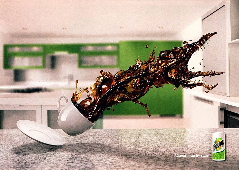
Amazing Paper Towel Ads!


I found this series of Bounty consumer advertisements in the Communication Arts Advertising Annual (54) from November-December, 2013. I think they are remarkable! The message is definitely that a little thing like the right paper towel can take on "monster" spills. The graphic work is outstanding. I love how the liquid spilling out of the glass or cup is taking on the shape of something out of the insect fear film genre from the 60s (I think it was the 60s). The mid-air "pre-spills" appear very scary, powerful, and out to do evil damage! Also, it's totally humorous, which I love in advertisements. Being a spiller, myself, I got a special kick out of these, and I'm also inspired by them in terms of what is possible in Photoshop and all the other amazing graphic design computer programs I'm learning how to use. They're just brilliant!


Credits:
Julian Newman, art director
Dennis Greeley, writer
Dennis Greeley/Julian Newman, creative directors
David Corr, executive creative director
Rob Feakins, chief creative officer
Saddington Baynes, retoucher
Publicis Kaplan Thaler, ad agency
Procter & Gamble, Bounty, client

Saturday, January 18, 2014

Panda Fashion

This image is an advertisement that I found in Lürzer's Int'l Archive: Ads, TV and Posters worldwide, Vol. 3-2001. It is advertising small glasses from the Marui fashion store (a once well-known international web shop that was based in Tokyo; it no longer exists as of 2008).


I am always drawn to photographs of animals, and this ad is particularly eye-catching as it shows a panda (or three different pandas) "wearing" different shapes of sunglasses, with only the words "IMAGE CHANGE" at the bottom. At first glance, it struck me as very cute and interesting, but I didn't know why the black around the eyes had different shapes; this made me curious to find out, which is what a well-designed advertisement should do. All I had to do was read the fine print "Small glasses from the Marui fashion store," and it was instantly clear. I found it to be very clever as an advertising design.

The designer's idea was very witty and playful. Also, the contrast (pandas being black and white) is extremely bold and grabs one's attention easily. The balance of the design is basically symmetrical, but it isn't at all boring because of these three funny, cute, interesting faces with what appear to be little smiles on them. This is a design that does not require many words. IMAGE CHANGE is all that is needed along with the photos to attract attention enough for people to lean in closer to see what it's all about. I think it's a fantastic design. Photoshop was likely used, and it's the perfect application for that particular software. Brilliant.

Tuesday, January 14, 2014

"Preblog" Blog - Testing...1..2..3..

So another semester begins! This is just a test blog to see how I want to format it. I'm going to insert an image to see what that will look like as well.


I was thrilled that Mobile Mutts Rescue Transport Organization decided to use the logo I designed in my typography class last semester! It's seen here on the first volunteer of the year award. It's also on their website and will appear in a book about dogs and rescues that will soon be available for purchase. Woohoo!